Recent work

A few recent websites — all live, all linked.

We won't pad this page with stock mockups or made-up case studies. These are real projects, with real businesses, that you can click through and judge for yourself.

Each project is different in scope and tone — that's intentional. Every site is shaped around what that specific business actually needs.

Homepage of Lakeside Pet Salon — soft blue and warm cream design with a happy retriever photo and a clear call-to-schedule button.
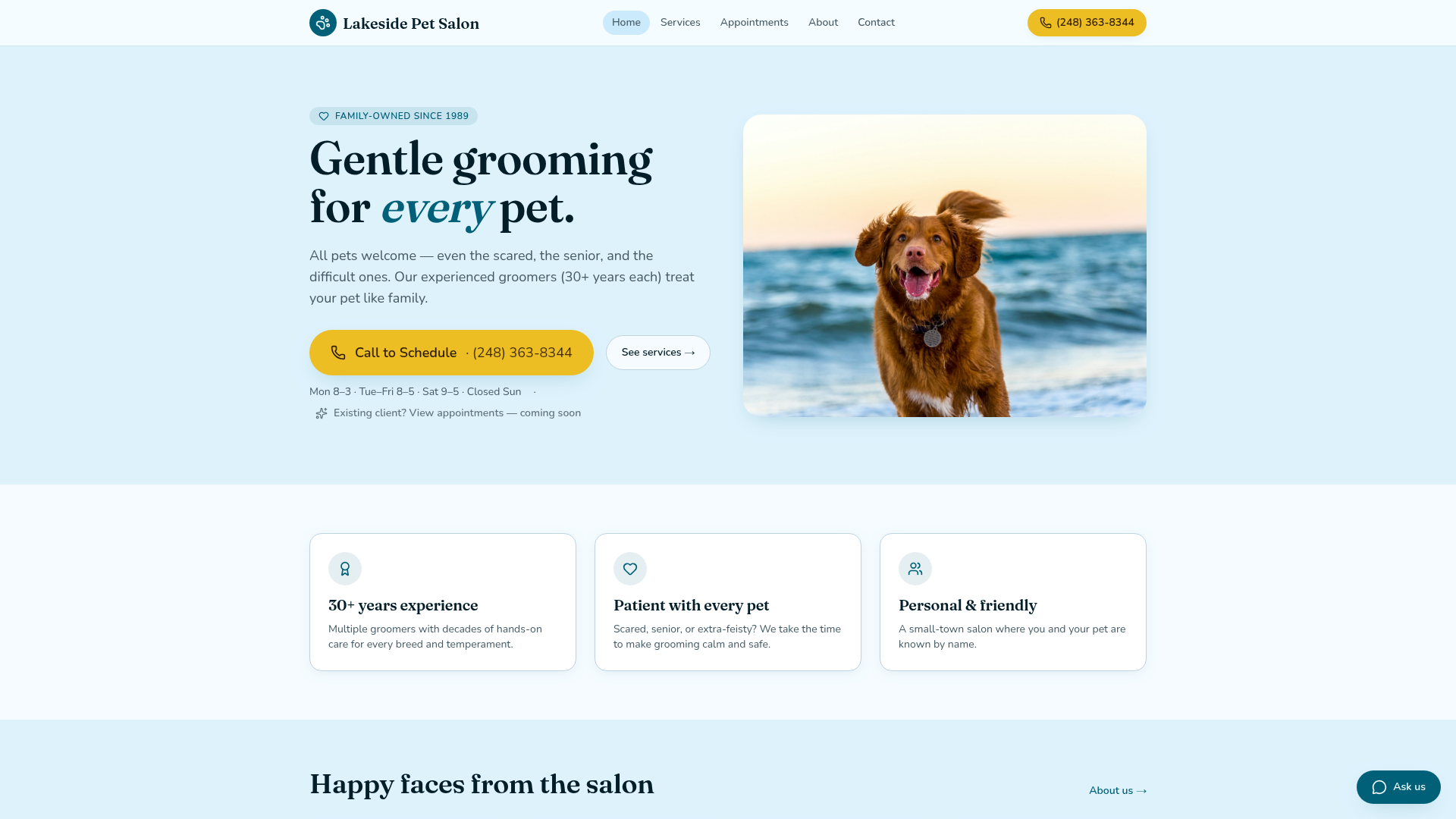
Local business · Pet grooming2025

Lakeside Pet Salon

lakesidepetsalon.com

A family-owned grooming salon (open since 1989) that needed a real website beyond a Facebook page — something that felt as warm and patient as the salon itself, with one-tap scheduling for phone-first customers.

What they needed
  • Replace an outdated/social-only presence with a clear local website
  • Make the phone number unmissable on mobile
  • Show hours, services, and the family-run personality
  • Pull real Google reviews into one trusted spot
What we built
  • Soft, calm color palette and editorial serif headline
  • Sticky 'Call to Schedule' button with the real phone number
  • Hours, services, and gallery laid out for phone-first visitors
  • Friendly testimonial section linked to live Google Reviews

Local Business Site package · launched in under three weeks.

Homepage of RevoMart — dark editorial design with a large headline about smart cooler pilot placements and a photo of a lit cooler in a luxe lobby.
B2B · Smart coolers & micro-markets2025

RevoMart

revomartllc.com

A new Metro Detroit company launching a smart-cooler / micro-market pilot program. Needed a confident, premium-feeling site to qualify property partners (apartments, offices, gyms, hotels) and explain a 60–90 day pilot in plain language.

What they needed
  • Position a brand-new company as credible and premium
  • Explain a multi-step pilot process to busy property managers
  • Qualify leads instead of collecting random inquiries
  • Make the offer feel local, hands-on, and low-risk
What we built
  • Dark editorial layout with a single bold headline-led hero
  • Solutions, Industries, and Locations sections shaped for property decision-makers
  • A dedicated 'qualify' flow that pre-screens early property partners
  • FAQ and About copy tuned to remove operational friction

Custom multi-page build · ongoing iteration as the pilot program grows.

Homepage of Fixavy — clean blue and white product site with the headline 'Find your next move faster' and a grid of free quiz tools.
Web product · Free personal tools2025

Fixavy

fixavy.com

A consumer web product that gives people free personalized scores, insights, and action plans for everyday decisions — money, work, school, productivity, and daily life. Needed a fast, conversion-focused front door for a growing library of free tools.

What they needed
  • A clear landing page that explains the product in seconds
  • Browseable categories so visitors find a relevant quiz fast
  • Honest 'no card, no signup' messaging up front
  • Bilingual structure (EN / ES) without bloating the design
What we built
  • Calm, product-style hero with a single primary action
  • Popular Tools grid surfacing high-intent quizzes first
  • Browse / Popular / Guides / Saved navigation tuned for repeat visits
  • Light/dark themes and EN/ES toggle wired into the layout

Custom product site · designed for ongoing growth and SEO.

Want one of these?

Tell us about your business — we'll point you at the right scope.

Not every project needs the same thing. A free review is the easiest way to find out what would actually move the needle for you.

Free website review

Not sure what your site is missing? We'll take a look — for free.

Send your current site or Facebook page. You'll get plain-English notes, no sales pitch.